.svg)

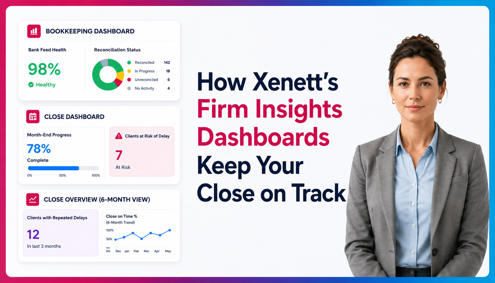
How Xenett's Firm Insights Dashboards Keep Your Close on Track

Ask questions, get summaries, or uncover key takeaways from this article.
Blog Summary / Key Takeaways
- Firm Insights gives accounting firms a real-time, firm-wide view of close health across every client engagement simultaneously, so problems surface before they become delays.
- The three dashboards solve different layers of the same problem: the Bookkeeping Dashboard monitors whether books are being maintained, the Close Dashboard tracks current-month close performance, and the Close Overview shows six-month patterns.
- A broken bank feed that goes undetected for two weeks means missing transaction data right before close. The Bookkeeping Dashboard surfaces this at the account level, early enough to fix it.
- The Close Dashboard's most valuable cards are predictive. The Clients at Risk of Delay card flags engagements likely to miss an upcoming deadline, giving managers a window to intervene before the date passes.
- Most close delays repeat because no one is looking at patterns across months. The Clients with Repeated Delays card makes that visible across three months per client and per manager.
- Firm Insights pairs data with ownership. Manager names appear directly on overdue and delay cards so conversations start with evidence, not guesswork.
Running an accounting firm means keeping dozens sometimes hundreds of client books on track simultaneously. Deadlines slip. Bank feeds break. A manager gets overloaded and three clients miss their close date. By the time you notice, the damage is done.
Xenett's Firm Insights section is built to prevent exactly this. Sitting inside the Operational Report module, it gives firm owners and managers a real-time, firm-wide control tower three interconnected dashboards that surface problems before they become crises: the Bookkeeping Dashboard, the Close Dashboard, and the Close Overview.
This guide walks through every feature of all three in detail, so you know exactly what you're looking at and how to use it to run a tighter close.
BOOKKEEPING DASHBOARD: Bank accounts, reconciliation status, and bank feed health across every client.
CLOSE DASHBOARD: 7 real-time cards tracking close performance, delays, and manager accountability.
CLOSE OVERVIEW: A 6-month cross-client table every engagement's close status in one view
Bookkeeping Dashboard:
The Bookkeeping Dashboard answers one question fast: are my clients' books actually being maintained? It lives as a tab inside the Client List module and pulls together all bank accounts across every connected client file into a single, scannable table.
Setting It Up: The Browser Extension Sync
Before any data appears, Xenett needs to learn about your client files. This happens through the Xenett browser extension a one-time setup that runs silently in the background once triggered.
→ Install the Xenett browser extension in Chrome or your supported browser.
→ Log into QuickBooks Online and open each client file at least once. One visit per file is all it takes.
→ After that initial visit, any future login to any client file in that QBO console automatically syncs data for all clients under that console.
→ If your firm spans multiple QBO consoles (e.g. different practice groups), you need one triggering visit per console not per client.
⚠️ Important: If your data looks stale or isn't showing up, check whether you've visited at least one file from each QBO console your clients are in. Each console syncs independently, so a visit to Console A won't refresh Console B.
Reading the Dashboard Table
Once synced, the dashboard shows a hierarchical table: clients at the top level, with their individual bank accounts nested underneath. Expand or collapse any client by clicking the arrow next to their name. Each account row contains four key columns:
Understanding Bank Feed Statuses
The Bank Feed column is one of the most operationally important columns in this dashboard. Here's what each status means in practice:
CONNECTED: The feed is live and pulling transactions automatically. No action needed.
BROKEN: The connection existed but has since failed, usually due to a bank-side password change, MFA prompt, or expired OAuth token. Transactions may be missing since the break point.
NOT CONNECTED: No feed was ever set up for this account. Transactions are being entered manually, or not at all.
💡 Pro tip: Scan the Bank Feed column at the start of every week. A "Broken" feed that's gone unnoticed for two weeks can mean missing two weeks of transaction data right before close.
Data Freshness & Timestamps
Each client group in the dashboard shows a timestamp indicating when that console's data was last synced. Because different QBO consoles sync independently, you may see different timestamps for different client groups. If a timestamp looks old, simply open any client file in that console to trigger a fresh sync.
Search and Export
Use the Search bar to filter by client name or account name, useful in larger firms with many clients. The Export Excel button downloads the entire table as a spreadsheet, which is handy for sharing a weekly bookkeeping health report with your operations team or partners.
Close Dashboard
If the Bookkeeping Dashboard is about day-to-day health, the Close Dashboard is about close-month performance. It's your firm's command centre for the accounting month-end close process, showing you across all clients, in real time, who's on track, who's late, who's at risk, and which patterns of delay keep repeating.
Navigate to it via Operational Report → Dashboard → Firm Level Insights in the left sidebar. A date selector at the top filters all seven cards simultaneously to the month you want to review.
Customising Your Layout
The dashboard supports full layout customisation. Click Customize in the top right to show or hide cards, reorder them by dragging, and resize them to suit your workflow. Layout changes apply firm-wide: so if you reorder the cards, every user in your firm sees the same layout. This is intentional: it keeps your team aligned on what matters most.
The 7 Cards: Explained in Detail
01: Close Overview
The headline card. A donut chart at the centre shows your total client count split into five categories, giving you an instant read on close health for the selected month.
→ On time completed: closed on or before the due date. This is your target number.
→ Late completed: closed after the due date. Done, but with a delay.
→ Upcoming: not yet closed, but the due date hasn't passed yet. Watch these.
→ Overdue: not yet closed and the due date has already passed. Needs immediate attention.
→ No due date: still open, but no deadline has ever been set for this client.
Below the chart, a summary shows total Completed and total Pending counts. Clicking any segment or number opens a filtered popup with the full client list for that category, searchable and exportable to Excel.
02: Critical Overdue
A focused alert list showing only the clients whose close date has passed by more than a configurable threshold and whose project is still incomplete. These are your most urgent cases.
Columns: Client name, assigned manager, days overdue, due date. Sorted by days overdue, highest first so the worst offenders are always at the top.
Config: Default threshold is 7 days. Click the Config button on the card, enter your preferred number of days, and save. Changes apply firm-wide instantly. Adjust this based on your SLA commitments some firms set it to 3 days; others use 14.
03 Client by Close Status
Shows a breakdown of how many projects are in each project status (e.g. In Progress, Review, Pending Client, Complete). It answers: where in the workflow are my projects actually sitting right now?
Click any project count to open a popup listing the specific projects in that status. Export the full breakdown to Excel for a snapshot you can share in a team meeting.
04 Average Close-Time
A month-by-month line chart showing how long your firm is taking, on average, to complete projects. Close time is measured from the last day of the close month to the date the project was marked complete. Only completed projects are included so this is a true performance metric, not inflated by pending work.
Click any data point on the chart to drill into the specific projects that contributed to that month's average, including each project's compilation date and exact number of days. This is invaluable for spotting whether your close time is trending up or down over the year.
05 Clients at Risk of Delay
This is a predictive card, it flags clients who haven't missed their due date yet but are statistically likely to. It uses two conditions that must both be true simultaneously:
→ Days remaining to the close date is at or below the configured threshold (default: 3 days)
→ Percentage of tasks still pending is at or above the configured threshold (default: 90%)
In plain terms: if a client has 2 days left and 95% of their tasks are still open, they're flagged. Act now, or they'll be in the Critical Overdue card next month.
Config: Both thresholds are adjustable (whole numbers only). Set them to reflect your firm's typical close velocity, a faster firm might use 5 days / 70%; a slower cadence might use 2 days / 85%.
06 Clients with Repeated Delays
Shows clients who have been delayed in at least one of the last three months (including the current month). Each row shows the client name, their assigned manager, and a per-month status column for the last three periods.
Each cell shows either "Late by X days" (completed after the due date) or "X days overdue" (still incomplete). This card helps you distinguish a one-off delay from a systemic pattern and identify which managers or client types are driving recurring issues.
Config: Adjust the minimum number of days past due that counts as a "delay." Default is 1 day. If you want to filter out minor one-day misses and only surface meaningful delays, raise this to 3 or 5.
07 Manager Performance (via card data)
While not a standalone card, manager names appear in the Critical Overdue and Repeated Delays cards alongside their clients. This creates natural accountability partners can see at a glance which managers are consistently flagged and start conversations with data, not anecdote.
💡 How to use the Close Dashboard in your weekly ops meeting: Set the date selector to the current month, review Critical Overdue first, then Clients at Risk of Delay. These two cards together tell you what's already broken and what's about to break. Then check Repeated Delays for patterns to address in your next 1-on-1 with managers.
Close Overview
The Close Dashboard is great for one month at a time. The Close Overview zooms out. It's a single table listing every active client with one column per month, covering the last six months showing each client's close status for every period at a glance.
Instead of opening 30 client files to understand where everyone stands historically, you get a scrollable, filterable, exportable grid that answers: over the past six months, which clients have been consistently on time, and which have been consistently late?
Reading the Table
Each row is a client. Each column is a close month. The cell at the intersection shows the close status for that client and that month. For clients with date-range projects (e.g. a quarterly engagement covering Jan–Mar), the status appears in the last month of that range so March for a Q1 project.
Click a client name directly to jump to their project list. No need to navigate through the Client List separately.
Searching and Filtering
The Close Overview has two levels of filtering:
→ Global Search bar - filters clients across all columns simultaneously. Start typing a client name to narrow the table.
→ Column-level filters - each month column has its own filter icon. Click it to filter rows by that specific column's values (e.g. show only clients with an "Overdue" status in April). Column filters reset when you refresh the page.
Clicking any column header sorts the table by that column. Click again to reverse the order. Default sort is alphabetical by client name (A → Z).
Customizing Your Columns
Click the column settings icon in the top-right of the table to open the column management panel. From here you can:
→ Drag rows to reorder columns
→ Uncheck any column to hide it from the table
→ Add columns from your client properties (e.g. industry, entity type, billing plan anything stored in Xenett's client record)
→ Choose Ascending or Descending for the direction months are displayed across the table
💡 Tip: Adding a "Manager" column from client properties to the Close Overview table turns it into a powerful manager performance review tool. You can sort by manager and quickly see which clients in their portfolio have had consistent delays over six months.
Column settings save and apply to your entire firm, everyone sees the same configuration.
Exporting
The Export Excel button in the top-right downloads the full table as a spreadsheet, six months of close status data for every active client. This is a great artefact for partner reviews, client business reviews, or internal QA audits of your close performance.
Quick Reference
How the Three Dashboards Work Together
Each dashboard solves a different layer of the same problem keeping your firm's close process healthy and visible.
Think of it as three layers of a health monitoring system: the Bookkeeping Dashboard watches the foundations (are books being maintained?), the Close Dashboard monitors active close health (is this month going well?), and the Close Overview reveals patterns over time (is the firm improving?).
The Real Cost of Not Having This Visibility
Most accounting firms manage client close health reactively, they find out a client is overdue when the client calls, or when a partner does a manual review. By then, the delay is already embedded. Fixing it takes twice the effort it would have taken to prevent it.
Xenett's Firm Insights section flips that dynamic. The Bookkeeping Dashboard surfaces broken feeds and unreconciled accounts before they block close. The Close Dashboard flags at-risk clients days before their due date. The Close Overview shows you in one scroll whether your firm's close process is getting better or worse month over month.
Together, they replace the reactive fire-fighting mode that most firms operate in with something closer to proactive, data-driven management. That's what accounting practice management software at this level is supposed to do.
FAQs
What Is Xenett Firm Insights?
Firm Insights is a set of three dashboards inside Xenett's Operational Report module: the Bookkeeping Dashboard, the Close Dashboard, and the Close Overview. Each answers a different question about close health. Access the Close Dashboard and Close Overview via Operational Report, then Dashboard, then Firm Level Insights in the left sidebar.
What Does the Bookkeeping Dashboard Show?
It shows every bank account across every connected client file in a single table. Columns cover reconciliation status, pending transaction counts, and bank feed health. The bank feed column is the most operationally important. A broken feed can mean missing transaction data going into close.
How Does Data Get Into the Bookkeeping Dashboard?
Through the Xenett browser extension. Install it, log into QuickBooks Online, and open each client file at least once. That visit triggers a sync for all clients under that QBO console. If your firm uses multiple consoles, you need one visit per console, not per client.
What Are the 7 Cards in the Close Dashboard?
The seven cards are: Close Overview, Critical Overdue, Client by Close Status, Average Close-Time, Clients at Risk of Delay, Clients with Repeated Delays, and Manager Performance. Each card is configurable. The layout can be reordered and resized, and changes apply firm-wide.
What Makes the Clients at Risk of Delay Card Useful?
It is the only predictive card. It flags clients who have not missed their deadline yet but are likely to, based on days remaining and percentage of tasks still open. Both thresholds are adjustable. The value is the window it creates to act before a deadline passes.
How Is the Close Overview Different From the Close Dashboard?
The Close Dashboard shows one month at a time. The Close Overview shows every active client across the last six months in a single table. Use the Close Dashboard in weekly ops meetings. Use the Close Overview for partner reviews and manager performance conversations.
Can I Filter and Export the Data?
Yes. The Bookkeeping Dashboard and Close Overview both have a search bar and an Export Excel button. The Close Overview also supports column-level filters and sortable headers. The Close Dashboard cards link to exportable client lists when you click any data point.
What Should I Review First in a Weekly Ops Meeting?
Start with Critical Overdue, then Clients at Risk of Delay. Those two cards show what is already broken and what is about to break. Then check Clients with Repeated Delays for patterns to address with individual managers.
Conclusion
Firm Insights works when firms treat close visibility as an operational requirement. The Bookkeeping Dashboard catches broken feeds before reconciliation begins. The Close Dashboard flags what is overdue and what is at risk before the month ends. The Close Overview shows whether the firm's close process is improving or repeating the same problems.
The data has always existed. Firm Insights puts it in one place, organized by urgency, with ownership attached. If your close process depends on someone remembering to check, that is the gap. Build the review habit around these dashboards and the reactive work largely stops.
Firm Insights is a set of three dashboards inside Xenett's Operational Report module: the Bookkeeping Dashboard, the Close Dashboard, and the Close Overview. Each answers a different question about close health. Access the Close Dashboard and Close Overview via Operational Report, then Dashboard, then Firm Level Insights in the left sidebar.
It shows every bank account across every connected client file in a single table. Columns cover reconciliation status, pending transaction counts, and bank feed health. The bank feed column is the most operationally important. A broken feed can mean missing transaction data going into close.
Through the Xenett browser extension. Install it, log into QuickBooks Online, and open each client file at least once. That visit triggers a sync for all clients under that QBO console. If your firm uses multiple consoles, you need one visit per console, not per client.
The seven cards are: Close Overview, Critical Overdue, Client by Close Status, Average Close-Time, Clients at Risk of Delay, Clients with Repeated Delays, and Manager Performance. Each card is configurable. The layout can be reordered and resized, and changes apply firm-wide.
It is the only predictive card. It flags clients who have not missed their deadline yet but are likely to, based on days remaining and percentage of tasks still open. Both thresholds are adjustable. The value is the window it creates to act before a deadline passes.
The Close Dashboard shows one month at a time. The Close Overview shows every active client across the last six months in a single table. Use the Close Dashboard in weekly ops meetings. Use the Close Overview for partner reviews and manager performance conversations.